As a studio, we like to use internal projects to explore themes, mediums and audiences that we wouldn't otherwise reach with our everyday client-base. This helps keep our approach fresh, inspired and dynamic. It's also a bit of fun. Each time we take a particular theme and run with it in whatever way feels interesting and unique.
This quarter's project was about bringing a book to life through data. One of our designers is particularly passionate about The Wheel of Time, a high fantasy series spanning 14 books and one prequel. We opted to explore a group of female magic-users—Aes Sedai—and document their influence as the series progresses.
Research
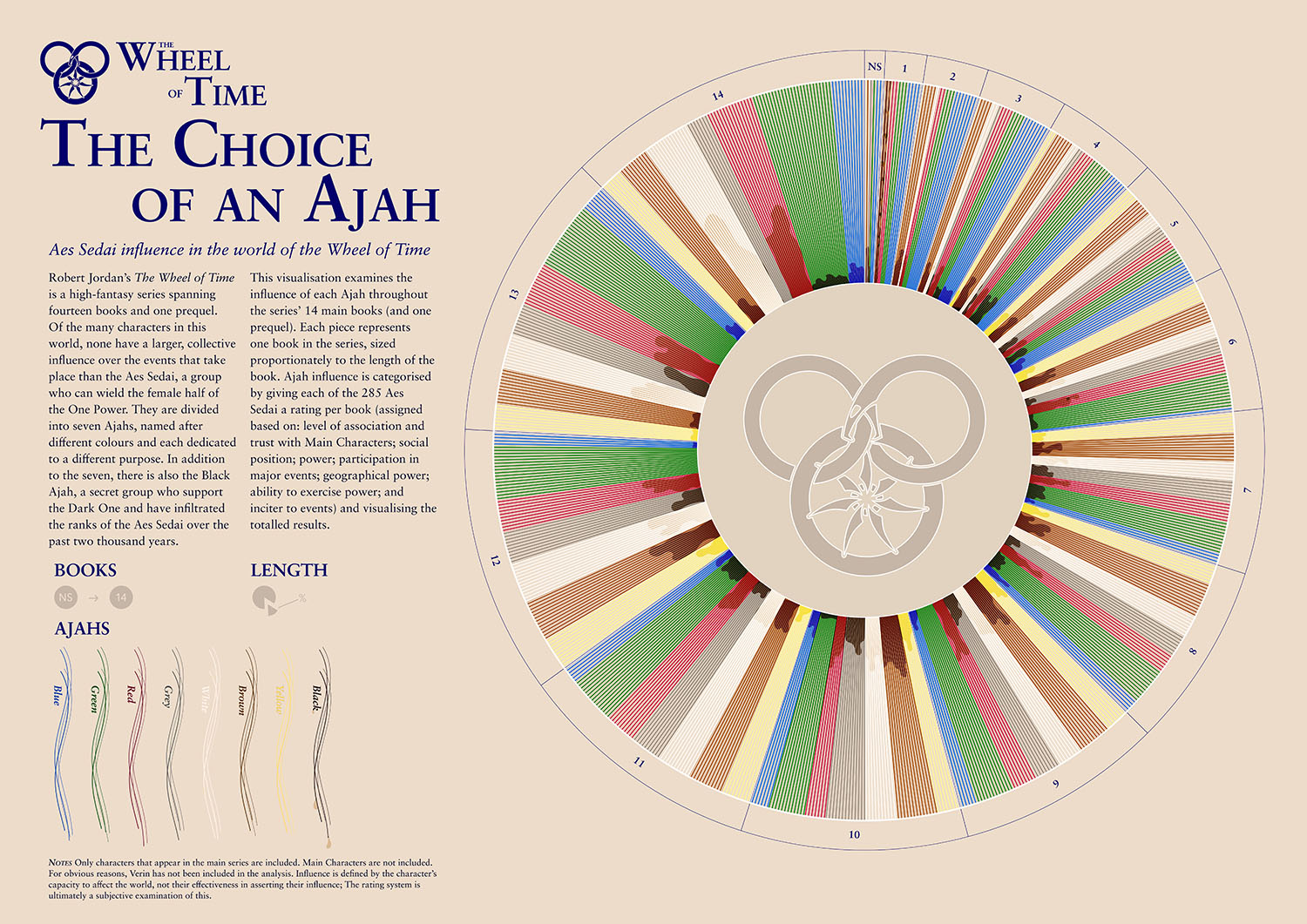
Relying on our chosen designer's specialised knowledge of the books, as well as some particularly detailed online archives, we manually catalogued every occurrence of all 265 Aes Sedai throughout each book and assigned each of them an influence grade (determined by their: level of association and trust with Main Characters; social position; power; participation in major events; geographical power; ability to exercise power; and inciter to events). We also categorised them by their Ajah (sub-groups delineated by colours), as well as those in the Black Ajah, who essentially operate as double agents.
A few concessions had to be made where:
a) There was insufficient data in the book to extract enough for a character's rating at any particular point;
b) Main characters who also fit into this group were excluded.
We further distinguished between influence and effectiveness, as there were examples of characters who had a lot of potential influence but never fully capitalised on it, and we felt our grading couldn't fully account for both at once.
Concept development
An objective of these internal projects is to be able to appeal to different groups of people. The obvious choice for a book is to look to those who have not read it—cover design being a prime example of this. But we also had a passionate fan who wanted to communicate with other readers of the series and show to them something that perhaps they had missed. We decided to design something that could work for both—a multi-layered approach that could be appreciated whether the viewer had a deep knowledge of the series or not.
Application
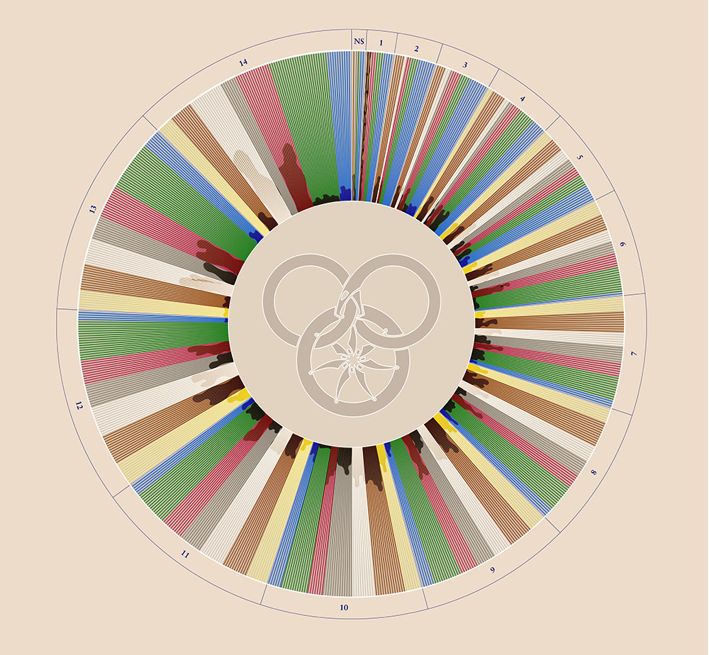
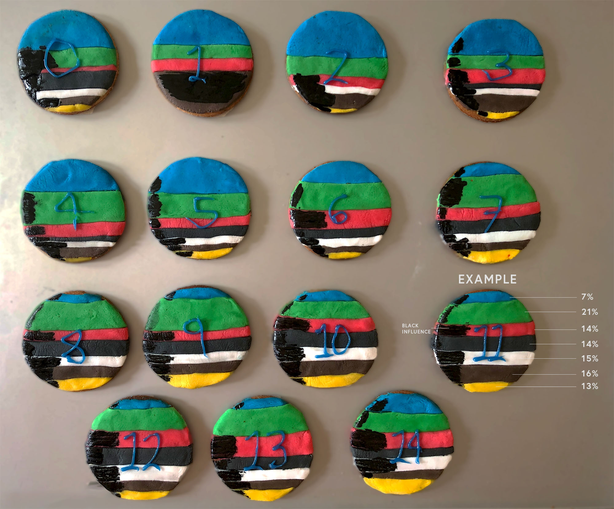
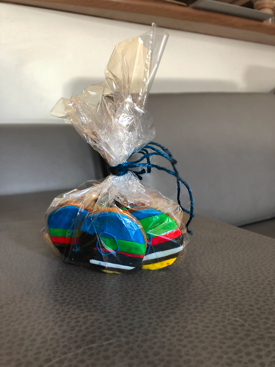
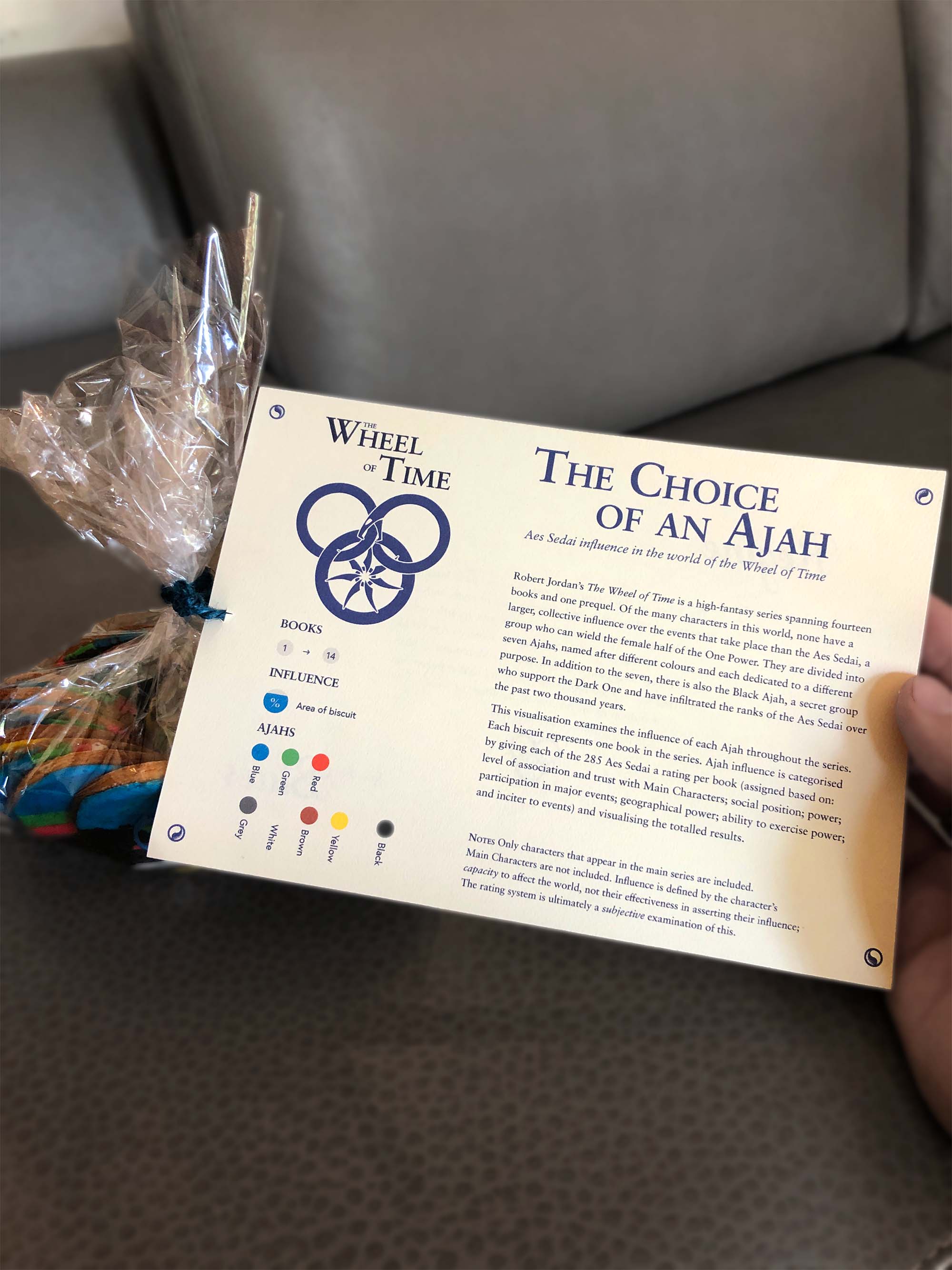
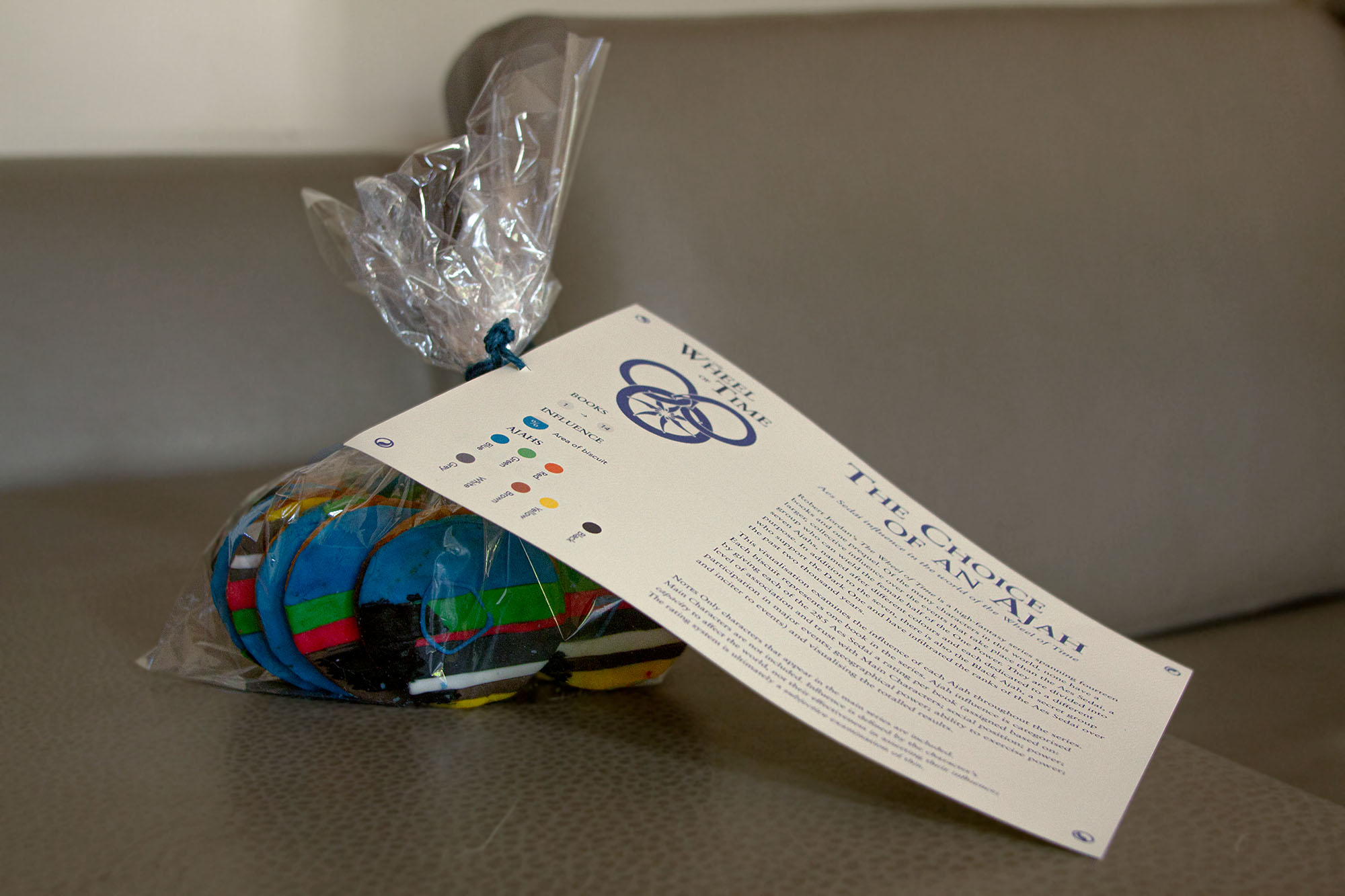
We settled on a layered pie diagram for the visual aspect, with each section's size proportionate to the length of the book. These were further cut into coloured blocks to represent each Ajah, as well as a black ooze for the double agents. With these projects, we like to do things a bit differently, so we turned it into an edible experience, drawing a simplified version onto cookies (one per book).
04
The Outcome
We received positive commentary on the visualisation, with an array of readers and non-readers in the office engaging with it on varying levels. While everyone agreed the cookies were delicious, we collectively decided not to pursue careers as bakers or cake decorators.

